How to Turn Transcripts into Data Visualizations
Learn how to use transcripts to make data visualizations— effective marketing tools both internally and externally.

Access to the right data allows marketers to make more informed decisions and create more compelling campaigns. Data visualization is a tool marketers can use to turn transcripts and other data points into valuable marketing aids, both internally and externally.
What is data visualization?
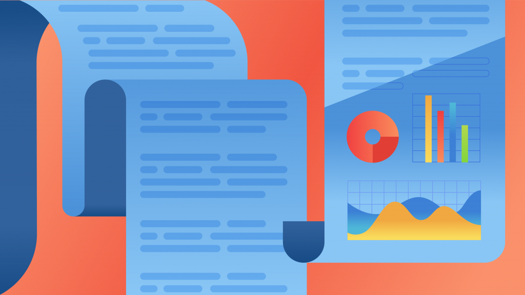
Data visualization uses visual elements like charts, graphs, dashboards, infographics and maps to present data in a graphical format. Presenting data in a visual format helps us quickly spot and understand trends, patterns and outliers in data. Data visualization makes the endless data at our disposal understandable and useful. This makes it an effective tool for not only marketers, but researchers and journalists as well.
Data visualization as an effective marketing tool
Visual communication is an effective way to quickly reach a wide audience. Research shows that 65% of the population are visual learners.
Marketing uses visual communication for conceptual and data-driven work, both internally and externally. Using data visualizations internally is the simplest way to share findings with your team. Externally, they can illustrate the value of your product or brand to potential customers.
People and businesses leave a massive digital footprint. Huge volumes of text data are created every day—think emails, social media conversations, customer support tickets, chats, surveys, articles, digital documents. Businesses also have a wealth of data in audio format that can often be overlooked—think focus groups, meetings, video content, and more. This wealth of data can be used to draw conclusions and gain insights. To use this audio data, have it transcribed and shared through a quick and affordable solution like Rev.
Once you have your data, you can consider the kind of analysis you want to perform.
Step 1: Analyze your data
Here’s where text analysis tools come in. Simpler tools such as cloud generators use basic text analysis to create a word cloud based on the word frequency and phrases that often go together.
More advanced text analysis techniques include sentiment analysis, also known as opinion mining. It uses machine learning algorithms to extract and interpret emotions from textual data.
These algorithms can collect data from multiple sources (tweets, emails, support tickets, product reviews, transcripts, etc.) then classify data points according to different criteria:
- Polarity (very positive, positive, neutral, negative, very negative). When analyzing product reviews, we can detect which product features people mention in a positive, neutral, or negative way.
- Feelings and emotions (happiness, sadness, frustration, anger, etc.)
Use cases of sentiment analysis are endless. They include social media and brand monitoring to keep a pulse on how audiences, experts, or the media perceive brands and products. Market research and competitive analysis also benefit from sentiment analysis. Transforming these insights into data visualizations can give you a better glimpse into the thoughts and behaviors of your customers and prospective customers.
Step 2: Transform your data into visualizations
The analysis of your data will likely live in the form of spreadsheets. To turn this into a data visualization, there are a few tools you can use. For simple data visualizations like charts and graphs, you can use tools within spreadsheet platforms like Sheets or Excel.
For more advanced data visualizations, you can utilize a platform like Flourish or Tableau. Explore different data visualization options to find which one best fits your needs.