Best Fonts for Captions and Subtitles in Videos
Make your subtitles easy to read. Discover 7 of the best fonts to use for captions in videos, to get clear and professional text on any screen.

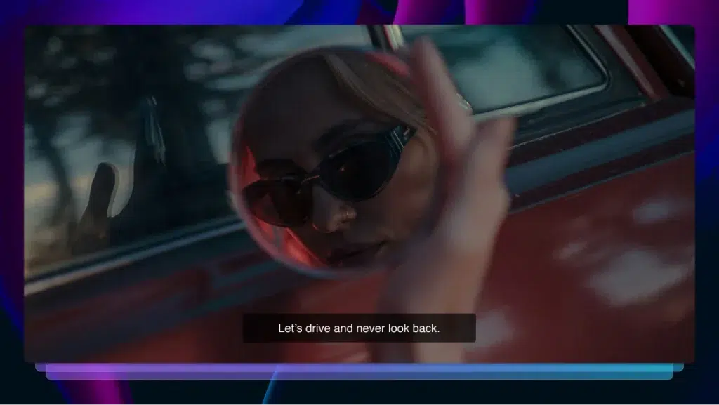
From conveying supplementary information to providing useful translations, adding closed captions and subtitles to video content is becoming more and more common. As well as enriching your content, captions and subtitles often also play an important role in making your content clear and accessible for everyone.
But with so many aesthetic font styles out there, it can be tricky to choose the best fonts for captions and subtitles, both in terms of branding and accessibility.
Luckily, we’ve put together this list of our favorite fonts for subtitles and captions to help you pick the right fit for your next project.
1. Lucida Grande
One of Adobe Premiere Pro CC’s standard fonts, Lucida Grande is a clear and simple sans-serif font that is actually a pretty solid option right out of the box when pulling text into Adobe Premiere Pro.
2. Arial
Another safe sans serif font to try out is Arial. Since, as a general rule of thumb, fonts for captions and subtitles shouldn’t be too flashy or distracting, this simple font is a great option.
If you are confident in the spacing of your text, you can also try out Arial Black, which is bolder and more striking on the screen. Beware, it gets a little bulky when working with longer sentences, so try it out on a few scenes before committing fully.
3. STIXGeneral
A more sophisticated serif option, STIXGeneral falls into our selection of the best fonts for subtitles in documentaries or video journalism projects in particular. Because of its more formal appearance, it’s also great for titles or white text preambles over black to help set exposition or tell a story.
If you’re using tons and tons of text throughout your video, this option might be a little too fancy, and it can be harder to make out in light-scene settings. But, if you’re looking to add some esteem to your project, this font can help elevate your video.
4. Verdana
A popular and very modern option, Verdana is a solid choice for projects dealing with technology and innovation, but it can be used virtually anywhere you want to make a good impression.
A sturdy serif font, Verdana looks tightly constructed and doesn’t take much unnecessary space at the bottom of the screen for subtitles. If you’re working with short or feature film projects, you might want to give this one a try. It’s also seen often with sci-fi-type projects and those that indicate concepts from the future.
5. Helvetica Neue
A font so popular that it has its own documentary, Helvetica is truly a famous (and now incredibly recognizable) typeface.
However, Helvetica Neue might be better, if not just for its diversity of options. In Premiere Pro, you can choose from over 10 versions of this font, giving you a truly full range for deciding on just how much space your text might need in any given situation.
6. Times
Similar to its brother font, Times New Roman, the Times font is one of the better fonts for subtitles given its more simplistic approach. Another example of a serif typeface for added sophistication, Times seems to be what we associate with a true “default” font to those who might be familiar with it from the heyday of Microsoft Word.
Even if you aren’t a fan, you should acknowledge the comfort it may provide to viewers. It seems to be recognized by people as “a regular font” and offers a non-distracting experience.
7. Futura
A personal favorite of ours, Futura is a flexible sans-serif font that is great in just about every situation. It remains remarkably clear and shows up on a variety of backgrounds, making it the best font for movie subtitles and presentation videos alike. You might even recognize it from viral social media videos where text on screen is key.
We like it as a regular font but would also recommend its condensed typeface version when you really need to cram a good deal of text into a small space.
Why Do Subtitles and Captions Matter?
The main reason to include subtitles and captions in your videos is accessibility.
Not only will adding captions mean that those who are deaf or hard of hearing can enjoy your video content, but they can also help any non-native speakers understand what is being said.
You may even find that adding subtitles to your video is not optional. Some platforms, such as those in the educational industry, won’t let you share your video without these captions. Accessibility rules aren’t consistently applied everywhere, so meeting the highest standard ensures your videos can be seen wherever you submit them.
Also, as film festivals and streaming platforms update their terms to require content creators to add captions, you’ll find that these text tools won’t just be a “nice to have,” they’ll be mandatory to remain competitive in an exploding media market.
Finally, adding translated subtitles to your English-language videos helps localize that content for global audiences. If you’re trying to tap into new audiences or grow your business in new markets, video localization and multilingual content marketing are both easy, cost-effective ways to unlock thousands of potential new viewers.
Whatever purpose you’re creating your video content for, it’s best not to leave your success to chance, and adding subtitles and closed captions puts you on equal footing with other players in your industry.
Order Subtitles for your Videos
How to Pick Fonts for Captions & Subtitles
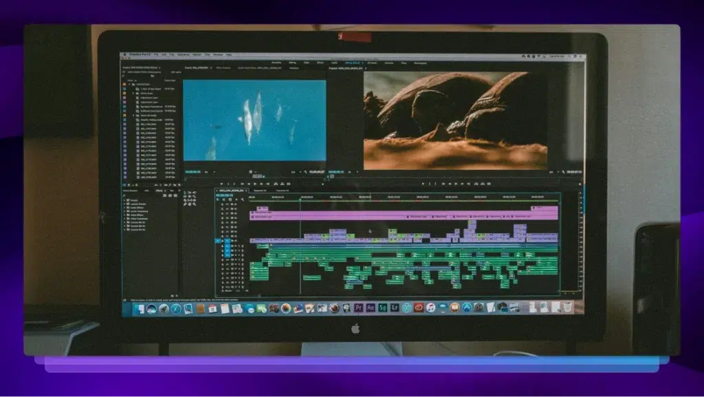
When it comes to actually adding your text, there are so many fonts for captions and subtitles to choose from, with top editing softwares often offering over 100 different font types in the basic font packages that come pre-installed.
There are also custom fonts for subtitles and captions that are available to be downloaded and shared, making the options almost overwhelming to the novice video editor.
So, how can you know which font will work best for your captions or subtitles? Here are some basic guidelines for selecting fonts for captions and subtitles that will communicate your message effectively without distracting from the video:
- Look for fonts that are clear, but not distracting or taking away from other information on-screen, visual or otherwise.
- Keep your font size manageable. It should be large enough to be read, but not so large that it cuts into the frame too much.
- Pro tip: check your captions and subtitles for bleeding when they are bolded or italicized.
- Avoid highly stylized fonts that are trendy or more popular than practical.
- Use fonts that meet the style guidelines for your brand or theme.
- Pro tip: Keeping your fonts consistent across all of your video content can further reinforce your branding.
- Look for platform video guidelines before you add your font. It may be a waste of time to choose fonts for captions or subtitles only to learn that your selected font won’t be allowed on your choice of streaming platform or video hosting service.
- Consider what font sizes work best for social media before posting.
While there are always some quick tricks like adding outlines or drop-shadows to make text pop, your choice of font is perhaps the most important decision in the process. Trial and error (and a visual test) might be the best way to narrow down your choice.
That being said, we’ve put together this list of the best fonts for subtitles and captions to get you started on your search.
What Is the Best Font Size for Subtitles?
When deciding what size font to use for your subtitles and captions, ask yourself about the purpose of the font. Is it to add context, or will it need to tell the entire story? This is an art in itself that finding the right font can help you achieve.
When picking the size of your fonts for captions or subtitles, it’s important to bear in mind that you want viewers to be able to see it clearly but not focus on the text over the video. You’ll also need to pick something big enough for those with poor eyesight to see, but not so big that it invades the frame.
The best way to find the right font size is just to have a play around – try out different size and font combinations until you find the right one for your project. We recommend starting out with 22-point. font for legibility and clarity and seeing how that looks.
Best Practices for Readable Captions
Subtitles are a great tool for boosting the accessibility of your video content. To ensure your captions are as accessible as possible, consider the following suggestions when creating them:
- Align your text to the left
- Use colors with strong contrast, such as white on a dark background or black on a light background
- Avoid harsh and distracting colors, such as neons
- Block any distractions behind the text
- Ensure captions remain readable with light and dark scenes, which may require changing the font color from time to time
Learn more about the best colors for any type of text on screen on our blog.
How to Add Custom Fonts for Subtitles With Rev
You don’t just have to use the default fonts available with your video editing software. Many platforms also support downloadable fonts for captions and subtitles, which you can find on the Internet.
The quickest and most efficient way to add captions to videos is using a professional service. Rev offers both human-created captions and AI-generated captions, as well as translated subtitles, providing everything you need for videos of all lengths and formats.
All you need to do is provide the video file (or a URL to where it’s publicly hosted on the Internet), select the language and turnaround time you want. No extra work for you or your team.
Order Subtitles for your Videos
Fonts for Subtitles and Captions FAQs
What Font Do Most YouTubers Use for Subtitles?
Depending on the type of content they create, different YouTubers use different fonts for their subtitles. Roboto Medium is the default option for subtitles for platform users, but YouTube comes with many free font options to choose from.
What Font Is Used for Yellow Subtitles?
The classic yellow subtitle that appears in films and video projects is often Helvetica Medium Italic. But, you can use whichever font you like – just be sure to do a visual test to check how well your chosen font shows up in frame.
Which Apps Are Best for Adding Captions to Videos?
Whatever project you’re working on, there are a range of captioning apps available on both Android and iPhone. Check out our favorite subtitles and closed captioning apps list to find out more.


