Introducing Our Rebranded Visual Identity


Rev › Blog › Rev Announcements ›
Welcome to Rev’s freshly redesigned brand, revamped to make your time in our speech-to-text universe more accessible and delightful to navigate.
These visual updates—from our modern new site and logo to the refreshed patterns, colors, and fonts—are outward manifestations of the broader changes we’re continually working toward to reimagine the future of speech technology.
The speech market is massive, growing, global, and ripe for technological advancement.
It’s an exciting time as brands increasingly incorporate digital accessibility best practices into their content and product design. And while Big Tech has a track record of not prioritizing inclusive design, many accessibility advocates are optimistic that the trend is changing.
In turn, we’ve consistently elevated our offerings to serve a broader range of individuals, enterprise teams, and developers around the world.
In its infancy, Rev relied solely on human freelancers typing behind screens—listening intently to provide true-to-word accuracy. But in 2016, with the onset of the deep-learning revolution, our speech-to-text took off at rapid speeds.
“The coupling of hiring intelligent people and working with a dataset that we had created over many years of doing human transcription translated into a very powerful automated speech recognition ecosystem. Now it’s humans and machines working together,” says Dan Kokotov, VP Engineering, Speech Technologies at Rev.
Using this tech, we’ve burned the midnight oil developing innovative products that enable users to broaden their reach, accelerate productivity, collaborate, and extract insights way more efficiently.
If you’re an early Rev customer—we’re talking 10-years-ago early—you’ve likely noticed how dramatically we’ve evolved over the years.
From exclusively offering translation services as “Fox Translate,” to now meeting the demands of the world’s biggest organizations with a full suite of speech-to-text solutions powered by the world’s best AI, we’ve come a long way.
And while our youthful startup glow–logo swoosh and all–was endearing, it was time to slip into something a little more sophisticated.
From our deep learning-powered AI to our community of 70,000+ freelancers, Rev is the culmination of many parts working together. So a larger, more nuanced visual system to mirror our complex suite of speech-to-text solutions was much needed.
A rebirth—a Rev-naissance, if you will—was the natural next step for us in our pursuit of helping the world understand the human voice.
So without further ado, allow ourselves to reintroduce… ourselves.
Accessibility That’s Actually Accessible
When you’re dealing with speech-to-text at scale, accessibility can be ironically (and frustratingly) inaccessible. That’s why we’ve prioritized inclusive design and made ease-of-use our main focus in this rebrand project.
Rev’s transcripts and captions meet demanding compliance standards. Accessibility is at the forefront of everything we do. So we were extra mindful to hold ourselves to the same rigorous standards when designing all creative assets.
At the most basic level, we made sure verbiage across our site is easy to follow. We also created scannable content by paying attention to content hierarchy: straightforward headers, lean paragraphs, and bulleted lists, etc.
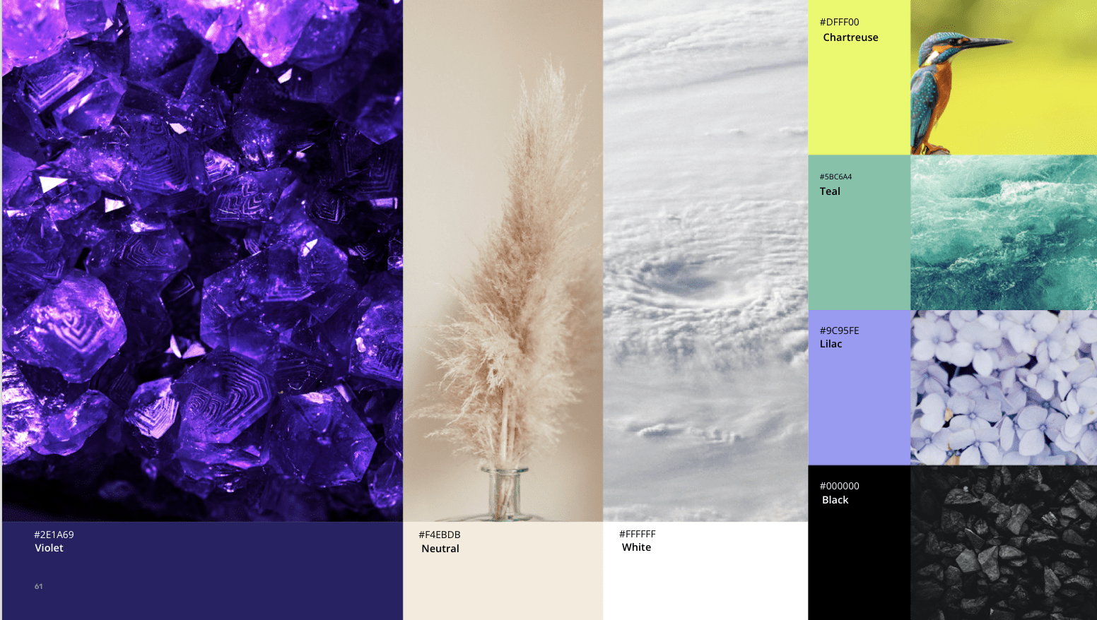
Contrast, too, is vital for accessibility–so each color and grouping has been tested to pass visual contrast standards.
For example, black type always appears on white, off-white, chartreuse, teal and lilac and white type always appears on black and violet. You’ll never see us use accent colors like chartreuse over other light accent colors.
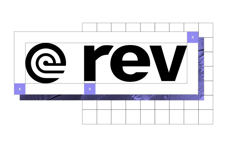
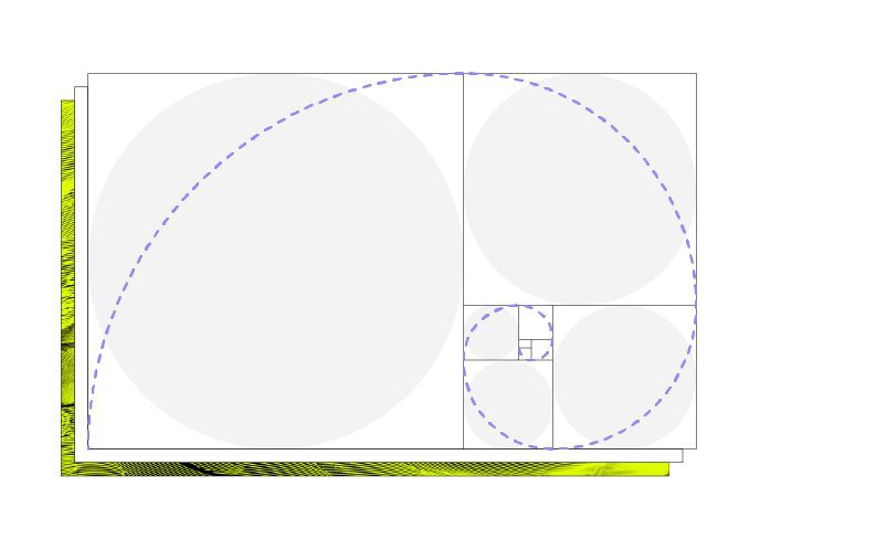
Logo
Rev is at the intersection of meticulous human effort and AI-powered technology—of man and machine.
The shape of the spiral is the thematic convergence. It’s found in the human cochlea—the part of the body that responds to sound waves—and is also how audio equipment visualizes sound.
Organic shapes
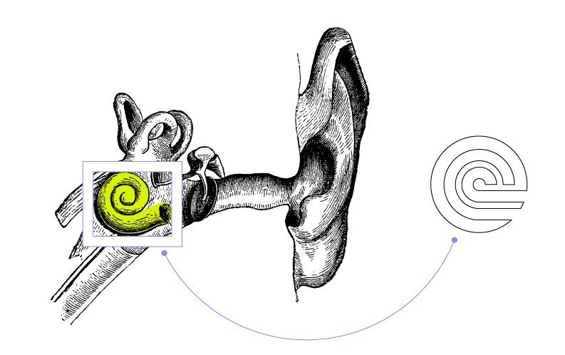
Nodding to the inner-ear spirals, the logo is inspired by the bodily structure that enables, or prohibits, listening. Accessibility is woven into the Rev story, so the logo reflects our commitment to inclusive innovation.
Human connection
Bending and curving, the logo reaffirms Rev’s commitment to adapting and evolving in order to prioritize the flourishing of its freelancer workforce.
Artificial intelligence
The logomark echoes the central letterform of the wordmark, the “e”. This is because our AI helps create an undeniable likeness of what’s said, but it takes a human touch to perfect.
Made for all

Our logomark is simple, bold, and legible; the typeface is clear and scalable. We designed it with simplicity to prioritize access.
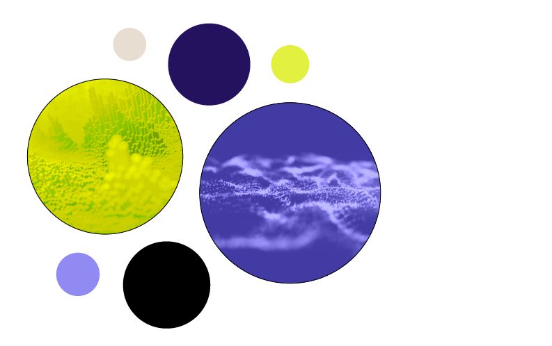
Roses Are… “Rev Violet”
Our scarlet stint has, in fact, come to a close. Were our ruby-hued days bold? Absolutely. Stimulating? Very. But red can sometimes be inaccessible for those with visual impairments.
We brought accessibility experts into the conversation throughout the whole rebrand process, but especially when determining our color palette.
We wanted our main color to be dynamic, intelligent… Something high-energy and maybe even a little regal, if possible?!
In close collaboration with Roy G. Biv, we journeyed to the tip of the rainbow and landed on (drumroll, please) hex color code #2E1A69, now known in this neck of the woods as “Rev Violet.”
It’s on the edge of our visible spectrum just like Rev’s on the edge of speech-to-text tech.
Coincidence? Definitely not.
Pattern Play

The patterns peppered across our properties draw inspiration from both natural systems and AI.
From alphabets to architecture and infrastructure, humans have always crafted systems to shelter, gather, and communicate.
We find patterns in nature—we mirror their structure and consistency to build our biggest marvels.
When we communicate with photos of natural systems, we call to mind the power of structure and human effort combined.
That combination is the heart of Rev: humans and AI making a system of language better and better.
Just Your Type
Words are part of our DNA. Focusing on bold typography allows us to tell stories not just with the meaning of the written word, but with the words themselves.
We created a typographical system that is easy to read in any situation. Plus, our new fonts–Raleway, Open Sans, and Lora–are all Google Fonts, which helps our site run faster and stay compatible with most devices.
Your Voice, Understood
We’re passionate about understanding the human voice. Our customers and Revvers comprise a broad, colorful spectrum.
You’ll notice our rebranded assets lean heavily on photography and videos of real people of all ages and ethnicities, shapes, and styles.
This intentional movement away from a vector-based illustration style–characterized by flat, generic shapes lacking realistic detail–allows us to better capture and celebrate the diversity in our community.
We’re proud to feature visuals showing people in the places where work happens now: living rooms, on the street–sometimes in offices or co-working spaces.
“We’ve evolved from a labor-only platform to an AI company that’s built on top of a labor platform. And that means we have a bigger story to tell. We want that story, from our messaging architecture to our visual assets, to show customers of all sizes that they can benefit from bringing their voice data to Rev—making it more actionable and more accessible. We’re incredibly proud to push the speech market forward and look sharp while we’re doing it.” – Jason Chicola, CEO and Founder at Rev